
Redesigning Mahindra’s Certificate Approval Portal
A unified approval experience that saves time and empowers action


TIMEFRAME
Feb 2020 - Apr 2020
ROLE
UX Research
Design Thinking
Design Library Kit
Wireframing & Prototyping
TEAM
Client
1 Project Manager
3 Developers
6 Designers
CONTEXT
Mahindra leaders wanted an approval system that was more efficient
During the early days of COVID-19, as remote work became the norm, Mahindra Rise - an Indian multinational conglomerate approached our agency to redesign their internal CEO-CFO Portal, essential for managing certificate approvals across Divisions, Sectors, and Companies. Collaborating remotely with fellow designers and Mahindra teams, I simplified and redesigned a complex, multi-tiered workflow used across the organization.
PROBLEM
Outdated workflows made certificate approvals slow
The CEO-CFO Portal’s cluttered interface and confusing workflows made it difficult for users across various roles to initiate and approve certificates efficiently, slowing down critical processes and increasing errors at the Division, Sector, and Company levels.
DESIGN RESPONSE
Making certificate approvals faster and easier to navigate
The redesigned experience focused on reducing friction in uploads, making approval progress visible, and improving discoverability across the portal. By introducing clearer workflows and better organization, users could quickly understand what required action and move approvals forward with fewer steps.
IMPACT
Approval times dropped by 40% and workflow errors fell by 60%, making certificate approvals faster and more reliable.
40%
Faster approval time
60%
Fewer approval workflow errors
67%
Fewer clicks to attach documents
2 Weeks
Teams fully adopted the new portal
30%
Drop in follow-up emails for missing documents
RESEARCH
What users and stakeholders told us
We conducted interviews based on shared screenshots and documented workflows, which helped clarify user journeys and uncover key pain points.
User Interviews
We conducted interviews with 3 Mahindra representatives who were well-versed in the portal’s operations. While they weren’t the direct end-users, their familiarity provided valuable insight into how the system was actually used.
INSIGHTS
Navigating the portal felt clunky and overwhelming


01
A cluttered and outdated interface
The design lacked visual hierarchy, making it difficult for users to focus on key actions or understand where to begin.
02
Lack of feedback or status indicators
Users had no clear visibility into progress or approval stages, leaving them unsure about what was completed or pending.
03
Multiple clicks required for simple tasks
The document upload process was unnecessarily complicated, requiring several steps to complete even the simplest action.
B. Stakeholder Conversations
We also held 2 focused discussions with stakeholders from Mahindra to understand the business objectives and long-term vision for the portal.
INSIGHTS
Stakeholders wanted a modern portal that still felt familiar and trustworthy
01
Simplify workflows across all levels
Stakeholders wanted a unified system that made certificate approvals smoother and easier for everyone, regardless of role or hierarchy.
02
A modern interface that aligns with Mahindra’s brand identity
They wanted a modern, intuitive redesign that retained Mahindra’s recognizable brand character, especially its signature red and clean visual tone.
03
Ensure approvals progress efficiently without bottlenecks
There was a strong focus on improving speed and reliability to prevent delays in the approval process and help leaders work more efficiently.
RESEARCH CONSTRAINTS
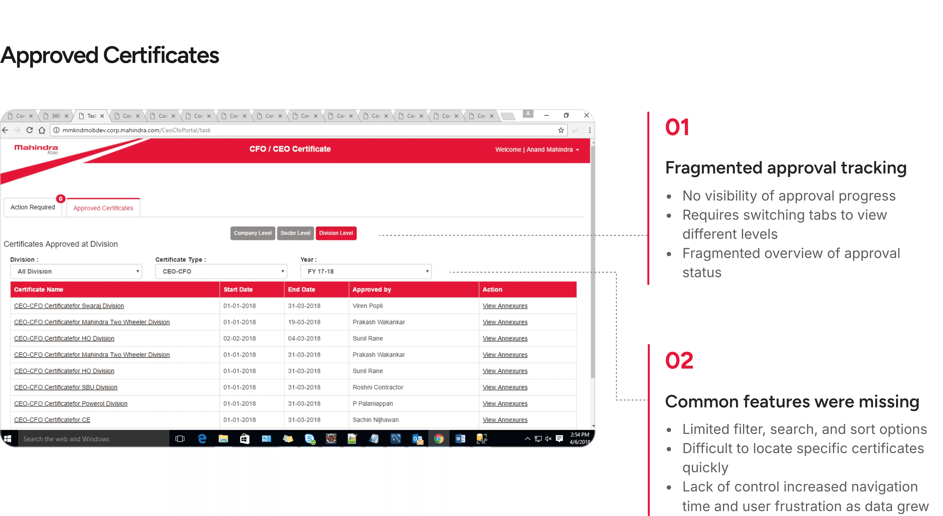
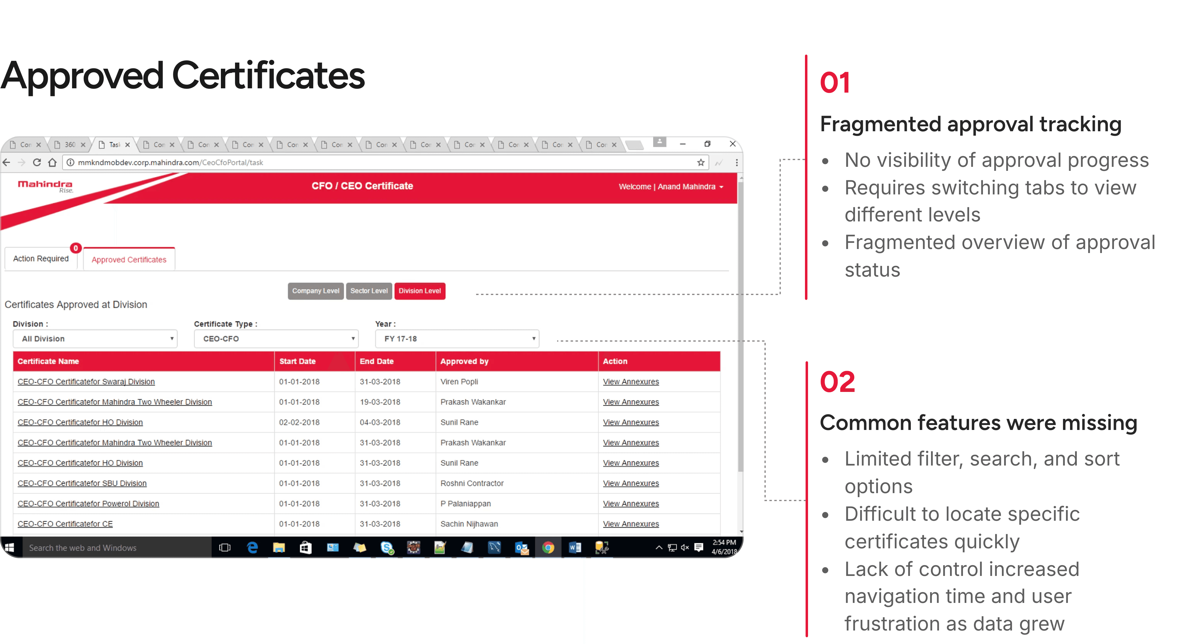
But the biggest hurdle was that I didn’t have access to the live portal or real users
Due to security protocols, we weren’t given access to Mahindra’s live portal or its real users. Instead, we worked with screenshots and gathered insights from three internal representatives familiar with the system. While helpful, this limited our ability to directly observe how end-users interacted with the platform.
Understanding the Workflow and User Roles
To design effectively, we first needed to understand user roles, access levels, and how approvals moved through the hierarchy. Through early discussions with the Mahindra team, we gained clarity on who could initiate, review, or approve certificates. These insights helped us identify bottlenecks and design for smoother workflows.

DISCOVERY
Six areas that needed improvement
Due to the platform's complexity and constraints, we could not address everything at once. Therefore, we identified six key areas that would make the most significant difference, improving clarity, reducing friction, and enhancing the overall approval experience.


DESIGN PRINCIPLES
From the areas of improvement, we crafted success criteria and corresponding product requirements for the new experience.
Visual Consistency
Designing a unified experience through a refreshed internal design system tailored for Mahindra, ensuring scalable components and cohesive user experience across all modules and hierarchy levels.
Discoverability
Users currently need at least 3 clicks and more than 10 seconds to track certificates across levels. Improving discoverability is critical for efficiency, allowing users to find what they need easily with minimum clicks.
Sense of familiarity
Ensuring that the experience feels intuitive and familiar, aligned with users' existing mental models and expectations. This minimizes the learning curve and cognitive load, making the system instantly usable.
Clarity and Control
Prioritizing transparency and immediate feedback by making actions clear, constraints visible upfront, and providing real-time responses to reduce errors during critical tasks like approvals and uploads.
DESIGN EXPLORATION
After defining the direction, I dived into the exploration phase
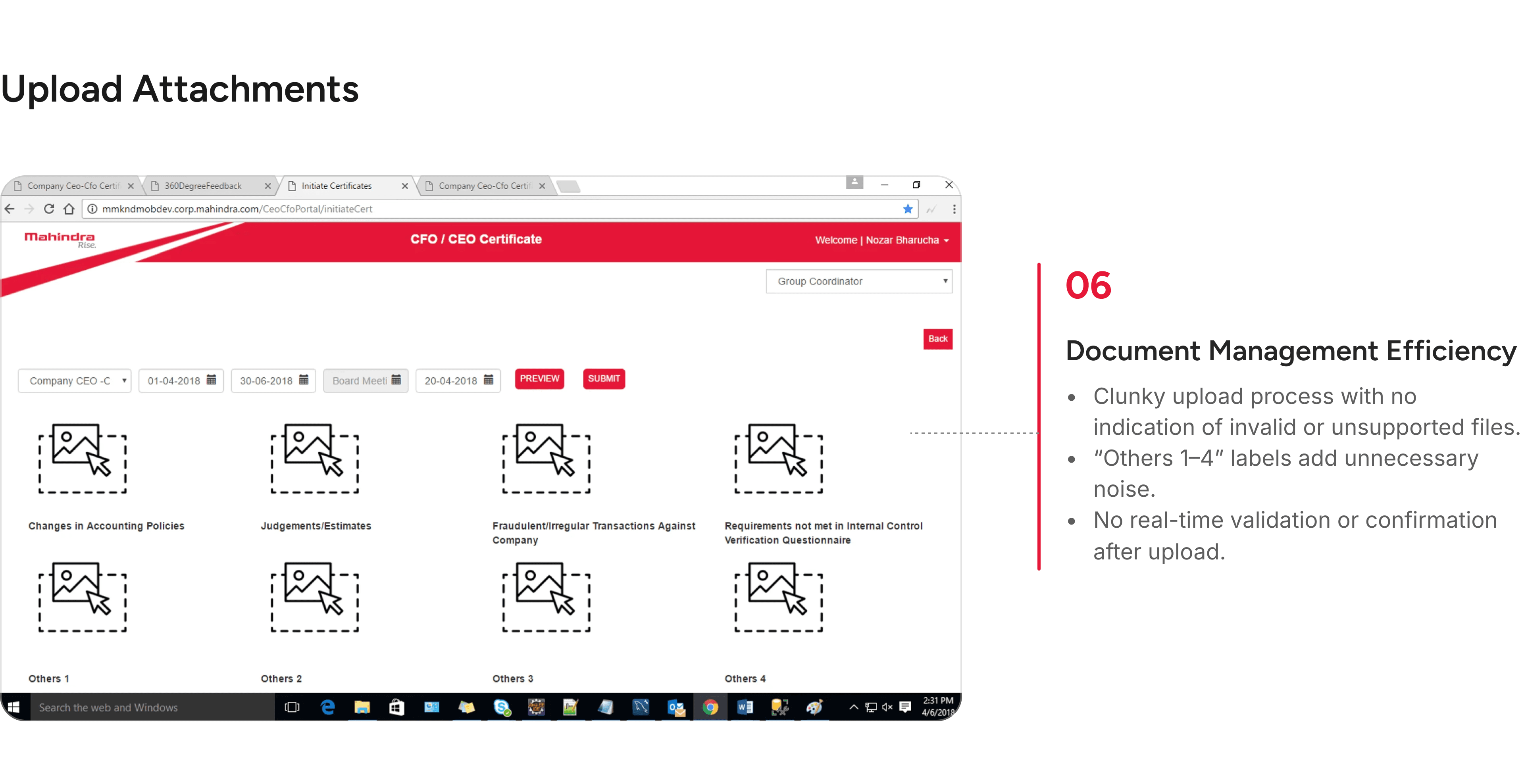
New Upload Experience
A cleaner, more intuitive layout that minimizes visual clutter and makes the upload process straightforward through a guided step-by-step flow.
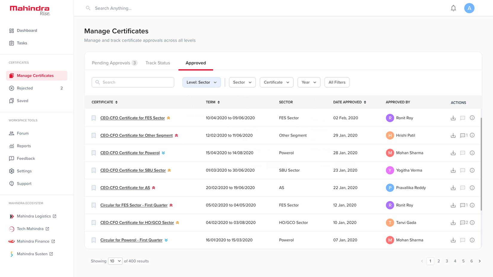
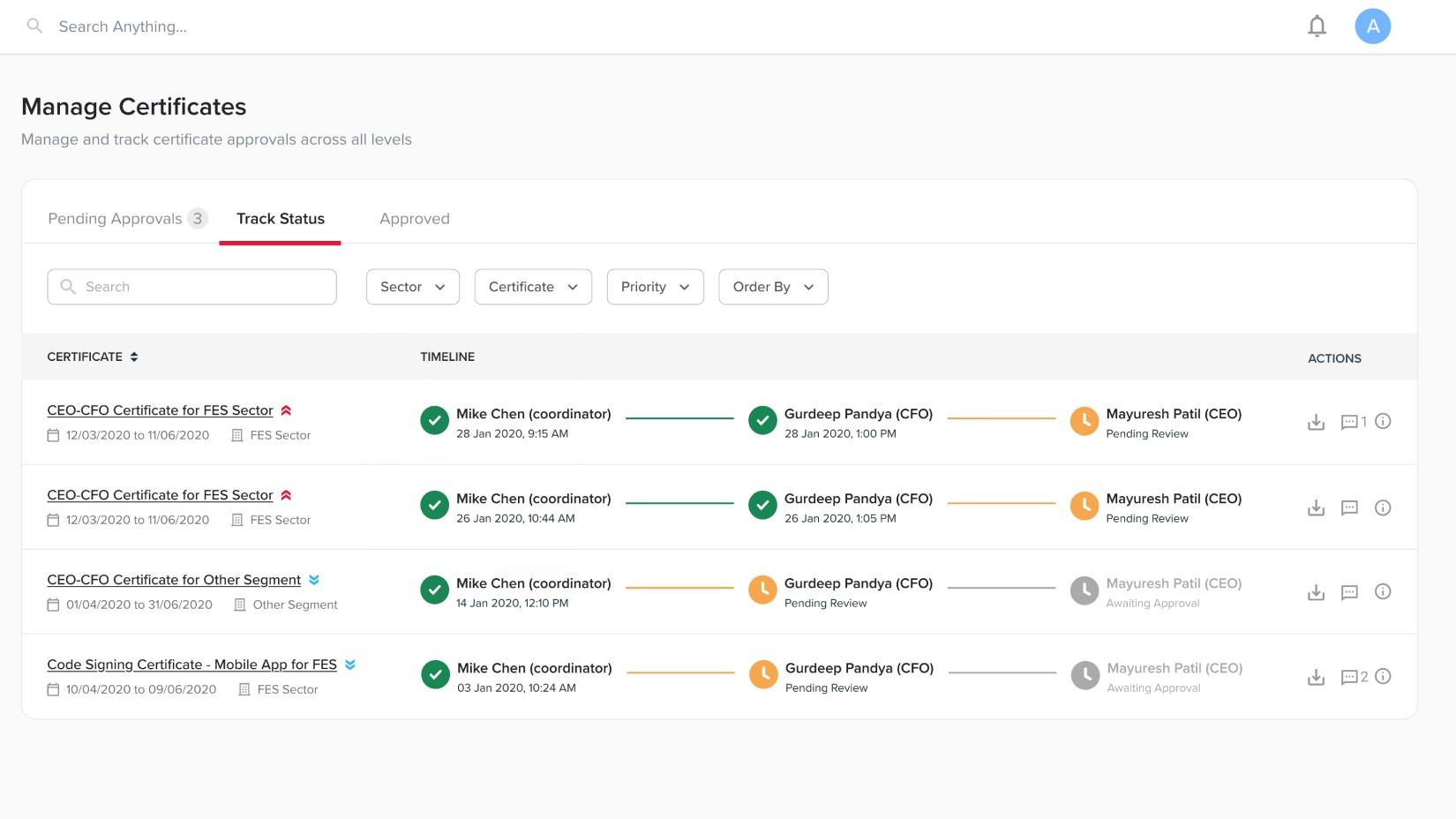
Unified Approval System
The new layout organizes approvals, tracking, and completed certificates into clear, dedicated tabs making navigation effortless and reducing cognitive load.
Upload Guardrails
Files are uploaded with real-time feedback, showing progress, success, or failure through clear messages.
Making Priorities Visible
Files can be tagged as Low, Medium, or High priority, allowing approvers to identify urgency quickly and act on critical certificates first.
Smarter Search and Filters
Added basic search and filters so that users can search and find certificates based on certificate name, type, level, department, priority, or date.
Collaborative Notes
A shared notes section allows users within the same level to leave comments or remarks on a certificate, keeping communication transparent and traceable.
Real-Time Updates
Receive instant notifications for new uploads, comments, and status changes.

Save For Later
Introduced a save feature with a dedicated page for quick access to frequently used certificates.
Design System
A new design system with cohesive layouts, standardized components, and refined visuals, which brings clarity, consistency, and modernity to the Mahindra portal.


MY LEARNINGS
Some of the things that I learned while working on this project
Balancing consistency with distinction
Designing within constraints taught me when to follow the existing design system and when to push its boundaries. Strategic divergence can drive innovation without diluting brand identity.
Flexibility in research methods
The COVID-19 pandemic necessitated adapting research methods. Using WhatsApp for qualitative research proved effective, enabling deeper and more sustained engagement than initially anticipated.
Knowing when to make trade-offs and when to prioritize critical elements is essential, especially when collaborating with clients and your tech team.
Gaining trust with high-fidelity
High-fidelity prototypes became essential for building the client’s trust. This trust allowed for deeper discovery work and adaptation to the project's needs.
NEXT PROJECT
Take me back
